 Front Counter
Recent work · October 2026
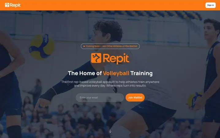
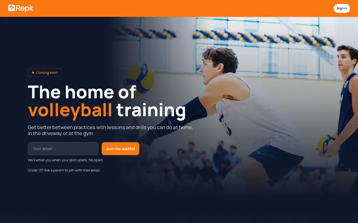
Repit Volleyball: before and after
Repit is a volleyball training app with lessons and drills from pro players. Its homepage is where athletes and parents land first, so it had to make sense on a phone and look right when someone shared the link.
What was wrong
- Shared links came up blank. The page was built entirely in the browser, so the first thing anyone (or anything) saw was an empty page. iMessage, Slack, X and LinkedIn previews showed nothing, and the page had no description or preview image.
- A heavy, outdated picture. The phone image was 4 MB and showed an old version of the app with stock photos.
- A claim that wasn't true. One feature card promised you could "compete with friends." The app didn't have that.
What I changed
- The page is built ahead of time. The words are in the page from the start, so link previews, search engines and slow phones all get real content right away.
- Proper link previews. A description and a 1200×630 preview image, so a shared link looks like a real business.
- Real screenshots, much lighter. Two screens from the current app replaced the old image: 565 KB instead of 4 MB.
- Only true claims. The made-up feature came off, replaced by things the app actually does.
- A cleaner first screen. One headline, one sentence, one box to fill in.
Full disclosure: I'm on Repit's founding team and build its app and website, so Repit isn't a paying client. I show it because it's real work you can go look at: repitvolleyball.com.
Want this for your business?
I'll make you a free mockup first. If you don't like it, that's the end of it.